
.svg)

Tableau vs. Power BI: How to Choose the Right Data Visualization Tool
min read

Ben Hale
Your operations are finally generating enough data to turn numbers into insights.
After months—or years—of growth, you’re ready to start using a data visualization tool to improve your business operations. Data visualizations aren’t just eye candy; they drive performance, alignment, and smarter decision making. In your solution search, you’ve probably discovered Tableau and Power BI as two clear category leaders. Which one can fuel your next stage of growth?
We work with growth-stage SaaS teams navigating this exact choice. We’ll show you how Tableau and Power BI compare on 5 key criteria. We’ll also discuss how each tool aligns with your company’s growth journey.
Key Data Visualization Criteria
- Cost
- Ease of Use
- Capabilities
- Data Integration
- Scalability and Performance
Cost: “Wallet” Fit in the Budget?
How much will the data visualization tool cost you? The price tag is the best place to start your evaluation. You can’t use the tool if you can’t afford it.
TLDR: Tableau vs. Power BI Analysis
If you're pinching pennies (or just watching your burn rate), Power BI usually wins—especially if your team already uses Microsoft 365.
Consider these important pricing factors:
- Pricing Model: common pricing models include subscription-based licensing, user-based pricing, and usage-based pricing. Make sure you understand what the recurring cost will be to your business.
- Additional Costs: implementation fees, maintenance fees, and training fees can give you post-purchase sticker shock. Do your due diligence to understand what the total cost of the solution will be.
- Functionality tiers: some features that you need might only be available in more expensive pricing tiers. Review the fine print to make sure you get everything you need with the tier you’re evaluating.
Tableau Cost Analysis
- Pricing Model: Tableau has nine total user-based pricing tiers.
- Additional Costs: going with Tableau may require training, support, and infrastructure expenses.
- Functionality Tiers: Tableau three levels of functionality with three sub-tiers, aligning with their pricing model.
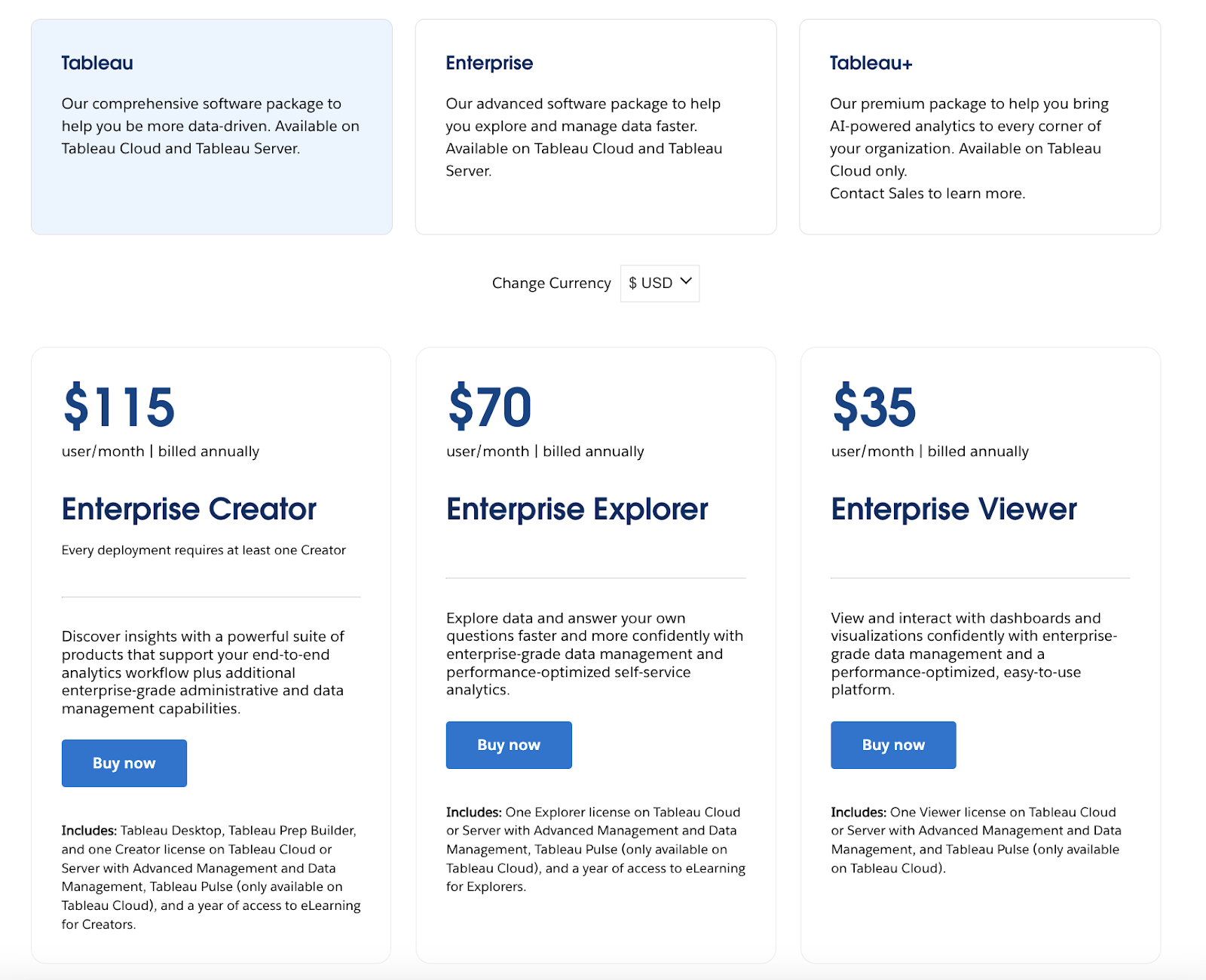
Source: Tableau
Power BI Cost Analysis
- Pricing Model: Power BI has a user-based subscription model. They also have an enterprise usage-based option.
- Additional Costs: storage, training, integration, maintenance are all possible additional costs.
- Functionality Tiers: Power BI’s free, pro, premium, and enterprise tiers have varying feature sets.
Source: Microsoft
Ease of Use: Drag, Drop, Done
How easy is the tool to use? If your team dreads opening a dashboard, your tool has already lost the battle.
TLDR: Tableau vs. Power BI Ease of Use Analysis
A faster learning curve = less time training and more time acting on insights. Think of Tableau like a high-performance sports car: it’s powerful, but you might stall a few times before getting the hang of the clutch. Power BI is more like a reliable hybrid; you can drive it off the lot.
There are three primary elements that make a data visualization tool easy to use:
- Intuitive Interface: drag-and-drop functionality, familiar design elements, and immediate feedback make it easy for you to use a data visualization tool.
- Interactive Features: features like filters, drill-downs, tooltips, and real-time updates help you explore data in-depth, gain deeper insights, and respond to trends and anomalies.
- No-Code Functionality: Tools that do not require coding skills make them accessible to you even if you’re a non-technical stakeholder.
Tableau Ease of Use Analysis
- Intuitive Interface: Tableau features drag-and-drop interaction, real-time previews, visualization suggestions, and visual design best practices. These features make the interface quite intuitive.
- Interactive Features: with interactive dashboards, customizable parameters, tooltips, and real-time data interaction, Tableau is a highly interactive data visualization tool.
- No-Code Functionality: Tableau’s interface doesn’t require coding know-how, and even includes pre-built calculation options.
Power BI Ease of Use Analysis
- Intuitive Interface: with a simple learning curve, drag-and-drop functionality, and customizable visuals, Power BI’s interface is quite intuitive.
- Interactive Features: Power BI’s dashboard actions, custom visuals, and tooltips make it quite interactive.
- No-Code Functionality: Power BI features self-serve, real-time data modeling and analytics that don’t require you to write complex code.
Visualization Capabilities: Charts that Spark Joy (and Strategy)
What kinds of visualization can the solution produce? The tool should be able to produce the exact charts and dashboards you need.
TLDR: Tableau vs. Power BI Visualization Capability Analysis
Tableau gives you pixel-perfect control and visually stunning dashboards. If you’re pitching to investors, showcasing performance, or driving strategic meetings, this matters.
Evaluate your visualization tool on these criteria:
- Design Principles: effective use of color and other design elements enhance the overall effectiveness of data visualizations.
- Appropriate Chart Selection: the right charts help you convey information clearly and effectively.
- Simplicity: visualizations that avoid unnecessary embellishments tend to be easier to understand.
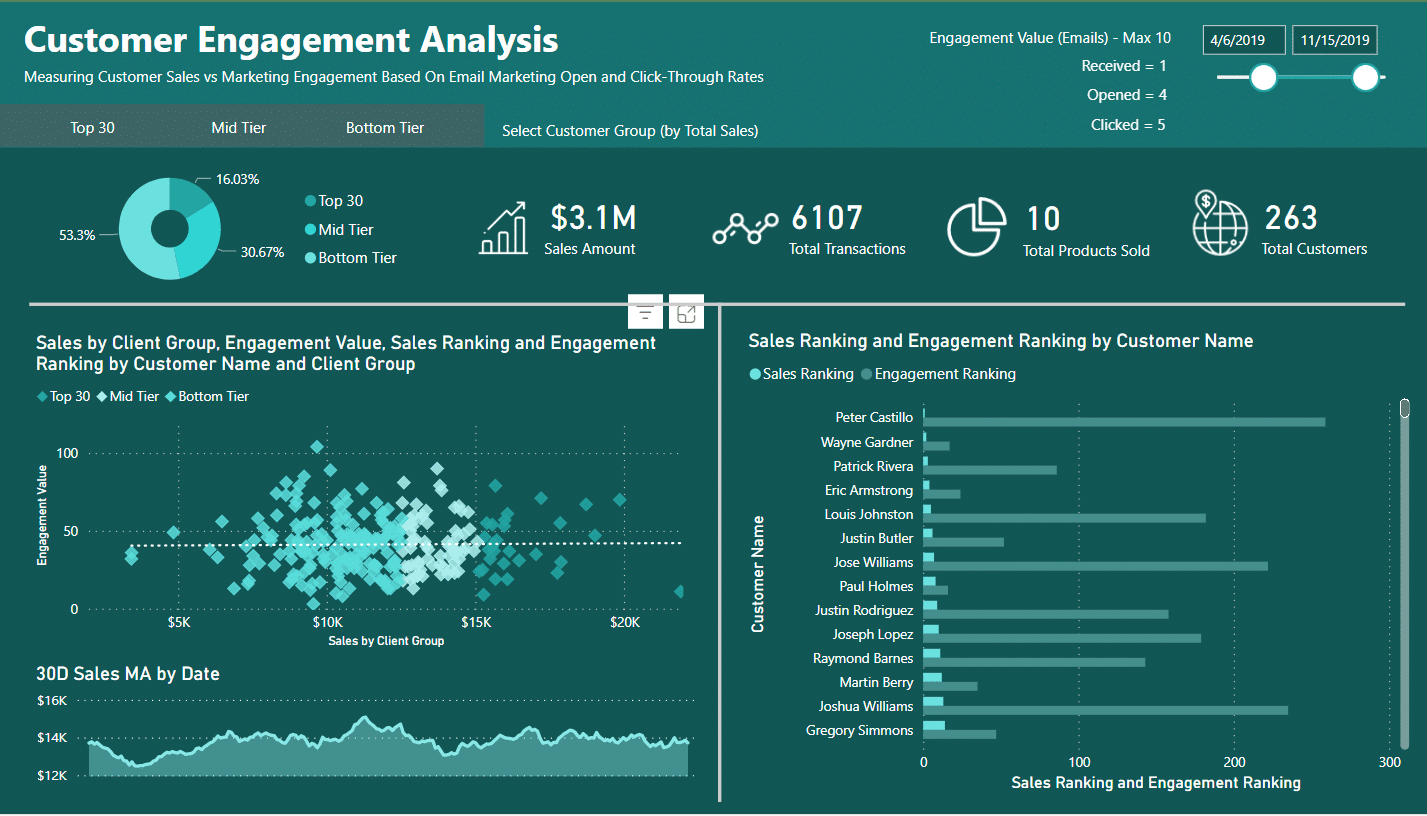
Tableau Visualization Capability Analysis
- Design Principles: Tableau's visualizations generally adhere to effective design principles, with smart color usage, logical layout options, and value-adding contextual elements.
- Appropriate Chart Selection: Tableau promotes effective chart selection by recommending appropriate chart types for specific data and offering a range of chart types.
- Simplicity: Tableau emphasizes decluttering in visualizations to maintain focus and simplicity.
Source: Seun Adeyemo
Power BI Visualization Capability Analysis
- Design Principles: Power BI's visualizations generally align well with effective design principles, emphasizing consistent branding and design and allowing users to apply brand colors, logos, and typography across all reports.
- Appropriate Chart Selection: Power BI encourages users to choose the right visualizations for specific data types, such as bar charts for comparisons and line charts for trends.
- Simplicity: Power BI’s charts and graphs are mostly decluttered with focused visuals.
Source: EnterpriseDNA
Data Integration: Playing Nice
How well does your data integrate with the visualization tool? Choosing a BI tool without considering integration is like buying a smart fridge that only speaks Klingon. It’s cool tech, but it’s useless in the kitchen.
TLDR: Tableau vs. Power BI Data Integration Analysis
Both tools integrate data effectively, but your ecosystem makes a difference. Power BI plays especially well with other tools in the Microsoft suite. Tableau performs across platforms.
Consider the following data integration criteria when selecting your tool:
- Ease of Integration: your visualization tool should connect to various data sources seamlessly, aggregating and synthesizing data from multiple platforms for comprehensive visibility.
- Data Compatibility: the visualization tool you use should be able to handle the volume, complexity, and format of your business data, supporting various data types and offering appropriate analysis options.
- Real-Time Functionality: real-time data integration ensures that the information displayed is always current, which is essential for making accurate and timely decisions.
Tableau Data Integration Analysis
- Ease of Integration: Tableau is quite easy to integrate due to its support for data blending and transformation, virtual data source connections, and integrations with third-party workflow automation tools.
- Data Compatibility: Tableau has native connectors for a wide range of data sources, like SQL, Excel, cloud databases like AWS, and CRM systems like Hubspot.
- Real-Time Functionality: Tableau supports real-time data integration with live connections.
Power BI Data Integration Analysis
- Ease of Integration: Power BI features data transformation and modeling features, making it easier to aggregate your data for visualization.
- Data Compatibility: Power BI has a library of connectors for various data sources, including Excel, SQL databases, cloud platforms like Azure and Google Analytics, and CRM systems like Salesforce.
- Real-Time Functionality: Power BI enables real-time updates from connected data sources, ensuring that dashboards and reports always reflect the most current information.
Scalability and Performance: Built to Grow or Bound to Break?
Can the visualization tool handle the volume of data you’re processing without sacrificing performance? Ideally, the tool will scale with you as you grow so you don’t have to get a new solution down the road.
TLDR: Tableau vs. Power BI Scalability and Performance Analysis
Got mountains of data? Tableau won’t flinch, but Power BI might start to sweat. If you’re growing fast, Tableau is more scalable out of the box and better suited for data-heavy environments. Power BI often hits limits without premium upgrades.
There are a few elements that impact a visualizations tool’s scalability and performance:
- Efficient Data Handling: your data visualization tool should be able to efficiently optimize queries, filter data, and use appropriate indexing techniques.
- Resource Management: you need a visualization tool that can minimize resource consumption, enable smooth interactivity, and prevent system freezes and crashes.
- Rendering Capabilities: your data visualization tool should have advanced rendering technology that supports high refresh rates and fast load-up speeds.
Tableau Scalability and Performance Analysis
- Efficient Data Handling: Tableau Server can scale vertically and horizontally, and it employs query optimization and data filtering techniques.
- Resource Management: Tableau offers the Resource Monitoring Tool, which allows you to monitor hardware metrics, receive alerts for resource constraints, and perform root-cause analysis to keep deployments running smoothly.
- Rendering Capabilities: Tableau’s scalability features are designed based on actual tests and comparisons between various Tableau versions, ensuring reliable performance as organizations grow.
Power BI Scalability and Performance Analysis
- Efficient Data Handling: Power BI offers features like DirectQuery and Live Connection, allowing it to query data directly from external sources in real-time.
- Resource Management: Power BI Premium provides dedicated cloud compute and storage resources.
- Rendering Capabilities: Power BI can process multiple data points simultaneously, but can experience performance issues.
The Bottom Line: Match Your Data Visualization Tool to Your Context
All told, the right data visualization tool depends on the specific context of your company. You will need to weigh and assess each element in this criteria set according to your business goals and priorities. You might even need to test drive the tools to see them in action.
Use this rubric to grade each data visualization tool you consider in your search:
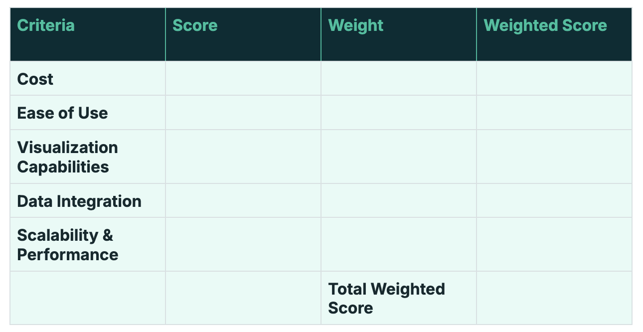
Download the editable rubric here.
Choose Tableau if:
- You need advanced and customizable visualization capabilities.
- You need to handle large and complex datasets efficiently.
- You require a more flexible deployment environment
For example, a data-heavy org scaling fast with mixed tools will get more value from Tableau.
Choose Power BI if:
- You have already invested heavily in the Microsoft ecosystem.
- You need a cost-effective solution.
- You prioritize usability and a quick learning curve.
For example, for a lean team with a Microsoft tech stack, Power BI will be a better fit.
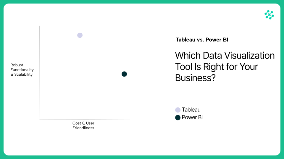
Power BI is a great option for organizations looking for a cost-effective and user-friendly BI solution, while Tableau is a better choice for those who need advanced visualization capabilities and can handle large datasets. Depending on what you optimize for, either tool could be a great fit for your organization.
Ready to go beyond dashboards and unlock smarter growth from your data? Let us show you how AI can turn your ops data into 3 free, actionable insights customized for your business. Contact us to see how.


